Improving the member FAQ experience
I was tasked with organizing the content for a full redesign of the Delta Dental member resources guide. The old section of the site was a tangled mess of lengthy articles that presented a dismal user experience. We endeavored to rewrite and reorganize the content into readable, accessible, mobile-friendly sections that followed a narrative flow. Utilizing research into page visits, we identified which content was prioritized by our members and I rewrote it, dividing it into a collection of new pages. The screenshots within this article show the dramatic change from the old page design to the new -- as well as how much improved the article experience is for our users.
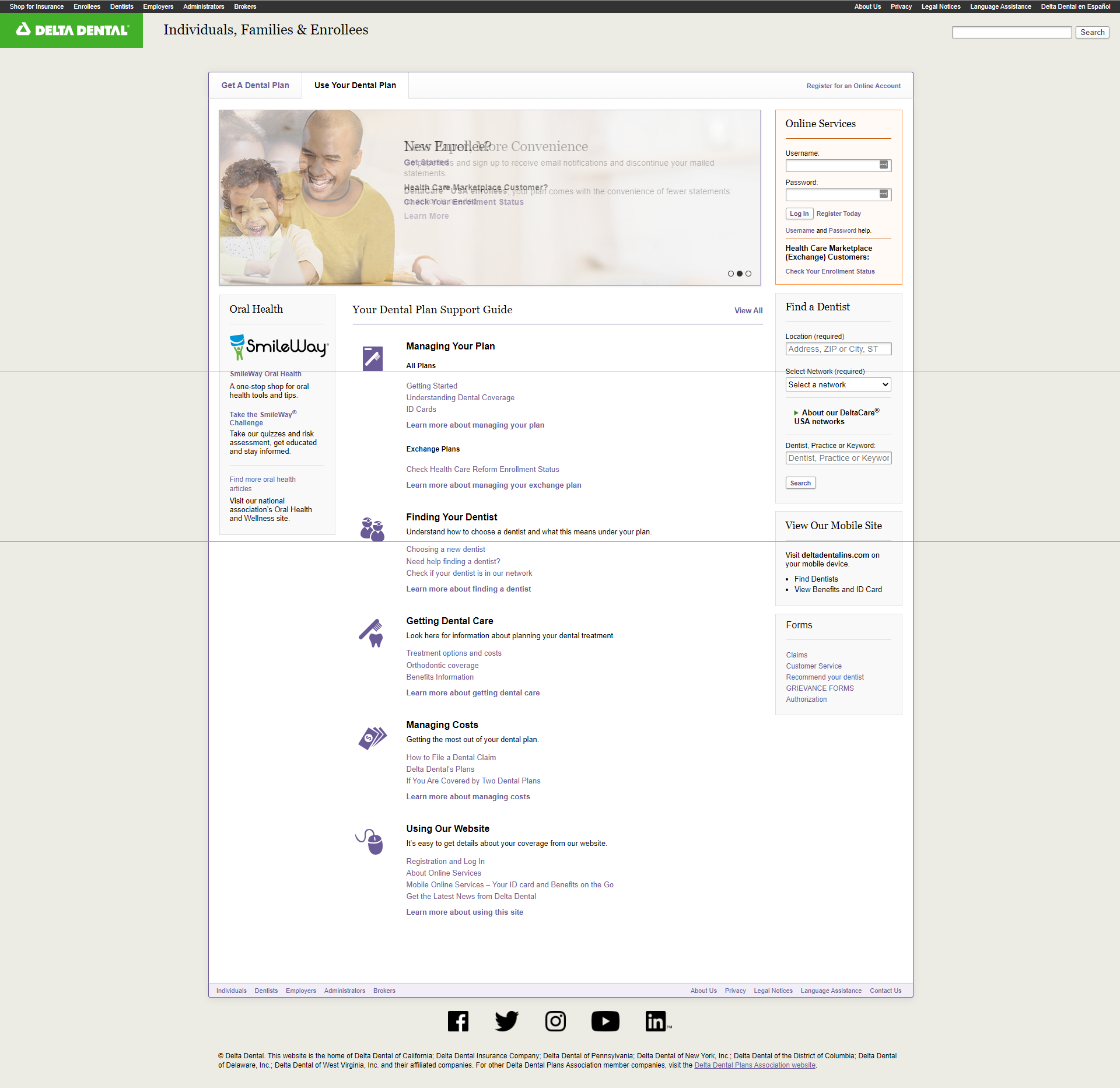
Old member resources guide - landing page
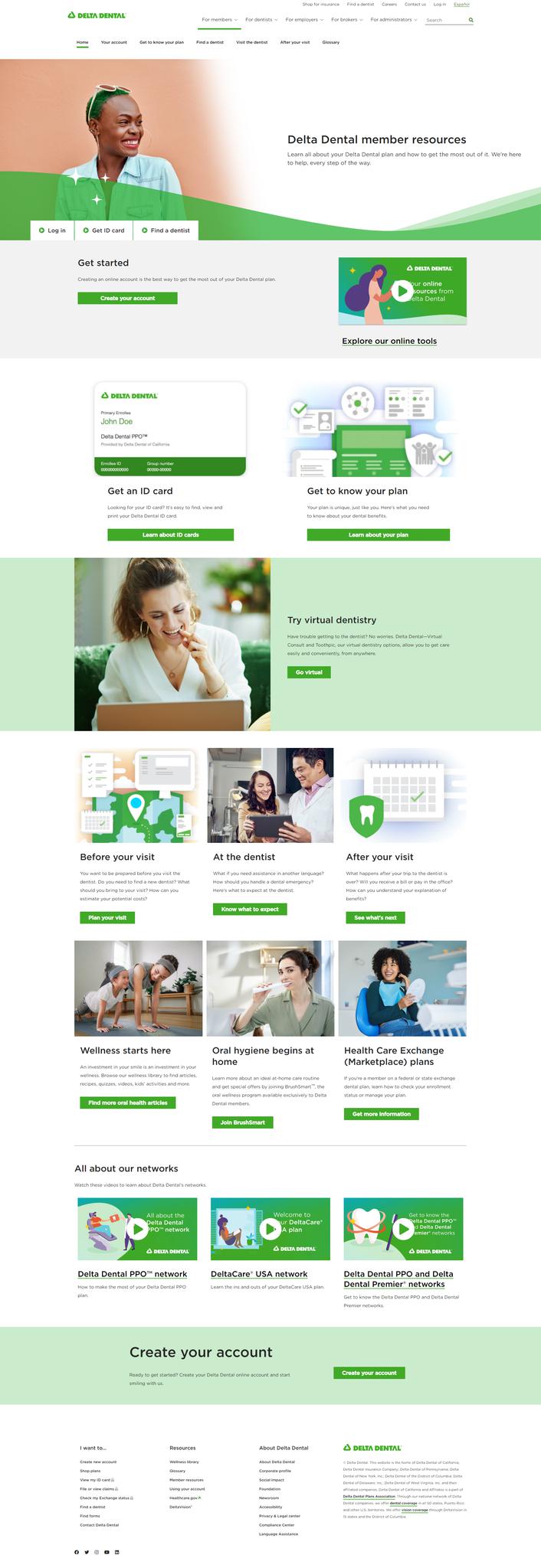
New member resources guide - landing page
The new design is all about the member's journey as they learn about their dental plan -- from getting started with their account to what they need to know about visiting the dentist -- before, during and after their visit.
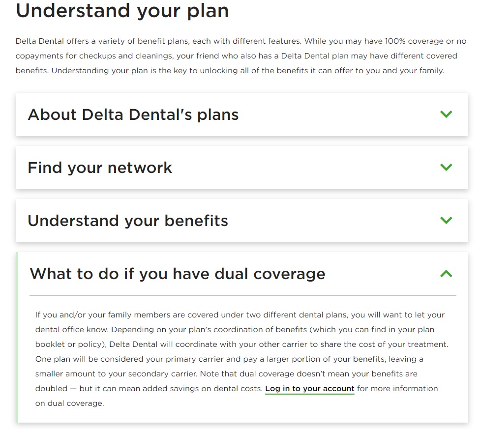
New member resources guide - articles
Rather than forcing users to sift through a bunch of long, wordy articles to find information, we broke down the important topics into bite-sized, mobile-friendly paragraphs and utilized an accordion design to reduce scrolling.